

EN BOC Graphics
B.O.C. Branding and Icon Development
EN BOC Graphics
B.O.C. Branding and Icon Development
With 21 outlets for bikes B.O.C. is at the forefront in this segment in Germany. Own brands are sold in markets predominantly under the name of "Bike & Outdoor Company". There are essentially 5 brands that addresses to the different target groups. yellow has redesigned these main brands and provided distinctive brand positioning. Besides the main branding, yellow has also developed name tags for the models, icons and other graphic elements for various bike models.

The brand “Bicycles” is targeted at quality conscious customers wishing to acquire a superior bike at a fair price. The graphics and word mark are deliberately kept minimal, focussing unobtrusively on the technical attributes of the bicycle model.
Gaining AESTHETIC BY REDUCING TO THE ESSENTIAL.
B.O.C. | Bicycles Branding, model descriptions and technical pictograms give a clear and direct message.

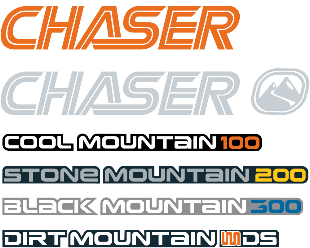
The “Chaser” brand appeals to kids and the youth wanting a sporty, cool bike. The word mark is designed to have a contemporary effect without the voguish feel. The graphical elements, by contrast, are kept modern and trendy and are revamped every season. The high-contrast colours support this image and also bring out the dynamic vibe of this youthful, reasonably priced brand.


B.O.C. | Component Branding – identifying the different material qualities

B.O.C | Graphic Decor, Technical Icons and Branding


GEOMETRIC FORMS, STRONG COLOURS AND CLEAN ANGULAR CONTOURS WITH THE LEAN AND MEAN VIBE.