
Markenentwicklung
und Produktdesign
für Nachhaltige Schreibgeräte Serie
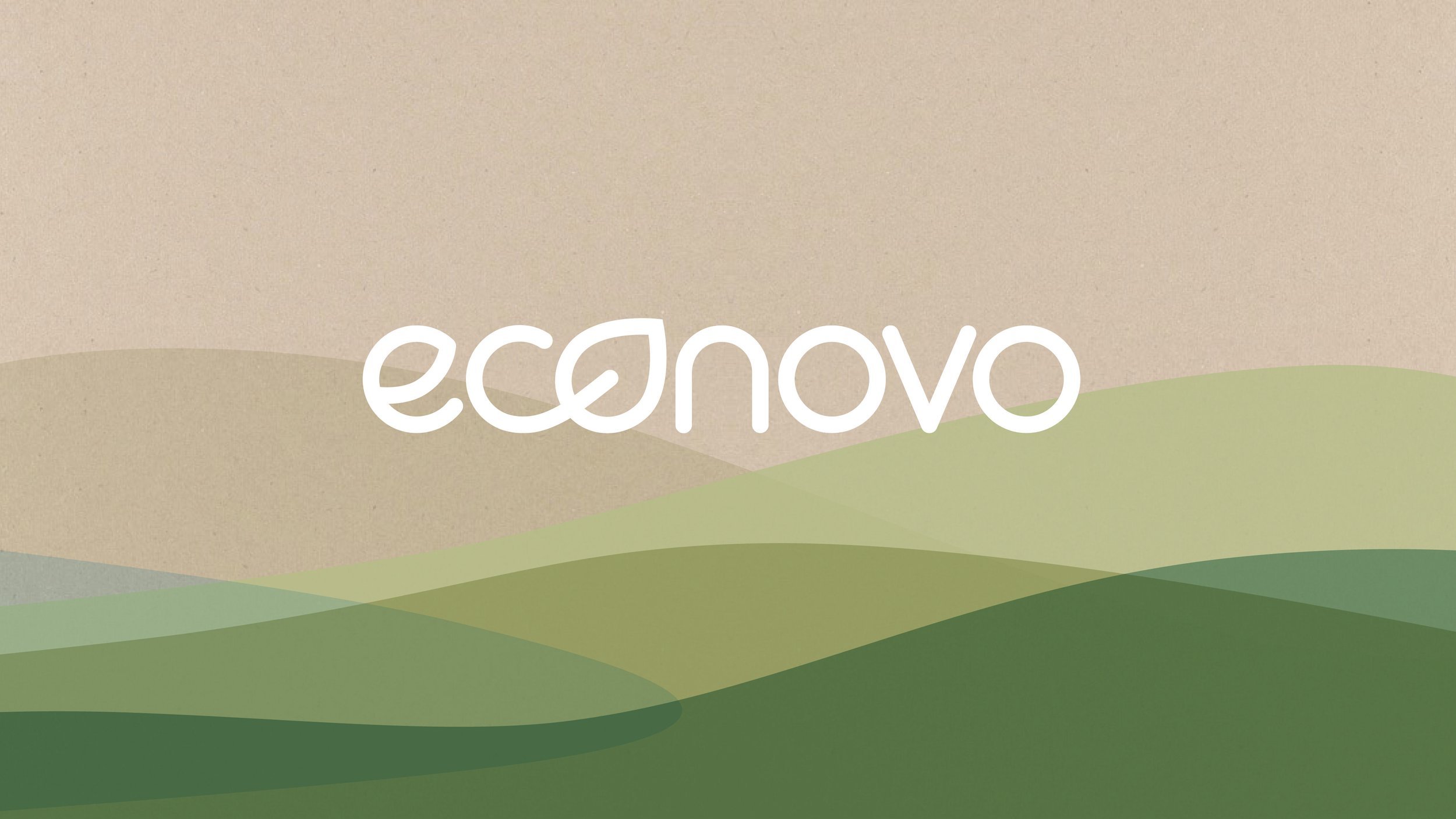
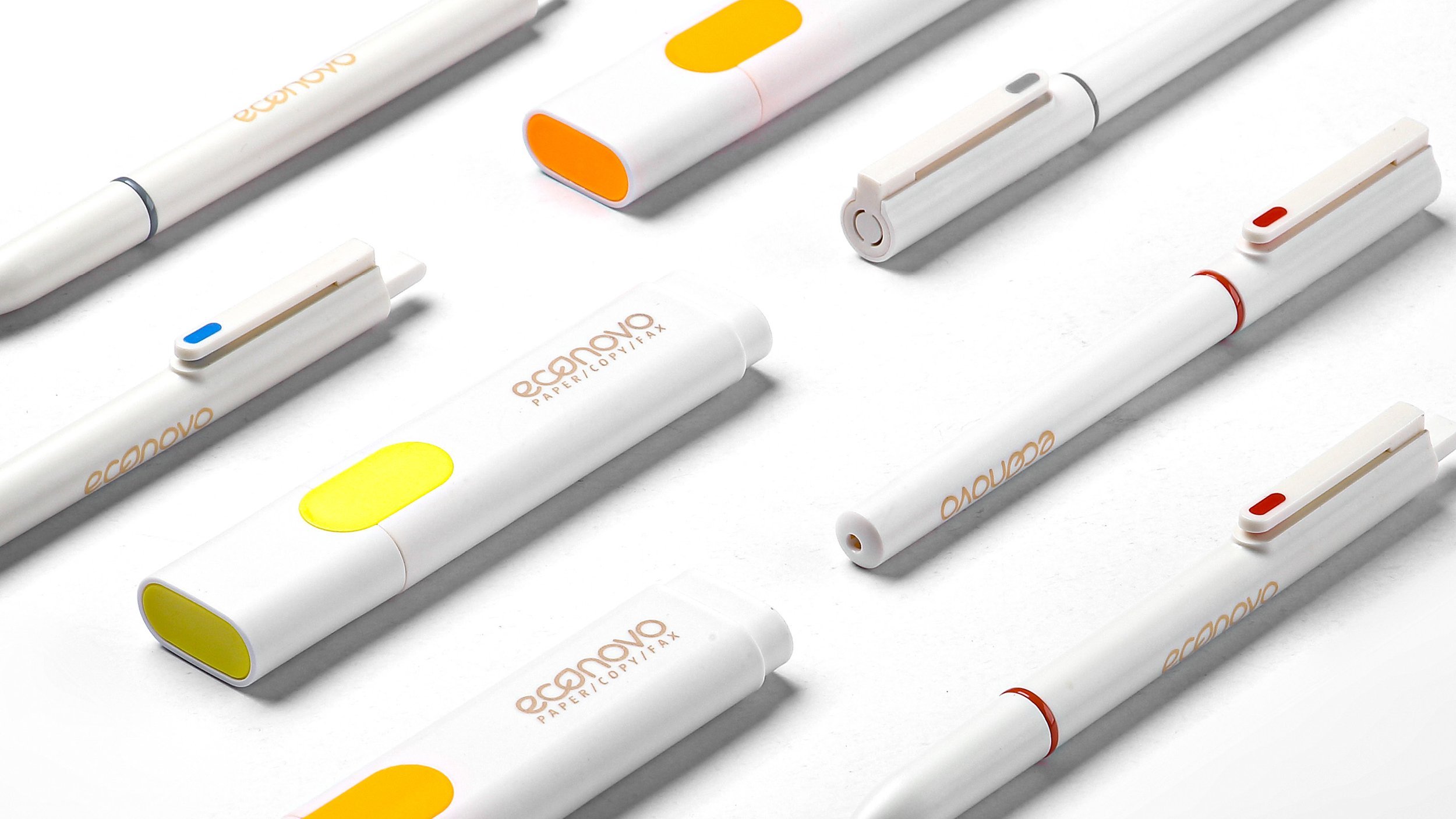
ECONOVO
#Nachhaltigkeit #Produktdesign #Markenentwicklung #Corporate Design #Packaging
Services für
ECONOVO
»Less waste for a better planet« – unter diesem Credo hat yellow design für JohnShen die neue Submarke »econovo« und ihre Produkte entwickelt und gestaltet.
Markenentwicklung und Produktdesign wurden dabei in einem interdisziplinären Designprozess aufeinander abgestimmt und so ein ganzheitliches Markenbild für econovo geschaffen.
weitere
Interdisziplinäre
projekte
-

DURABLE | Interdisciplinary
Ganzheitliche Markenentwicklung für den strategischen Wandel eines Traditionsunternehmens
-

MAPA | NUK | interdisciplinary
Ikonografisches Design und emotionale Dekore für Baby- und Kleinkinderprodukte
-

HOESCH | interdisciplinary
Multisensorische Erlebniswelten für Bad- und Wellnessprodukte vom Traditionsunternehmen
