

EN BRITA Professional | CD
BRITA Professional Filter | Corporate Design
EN BRITA Professional | CD
BRITA Professional Filter | Corporate Design
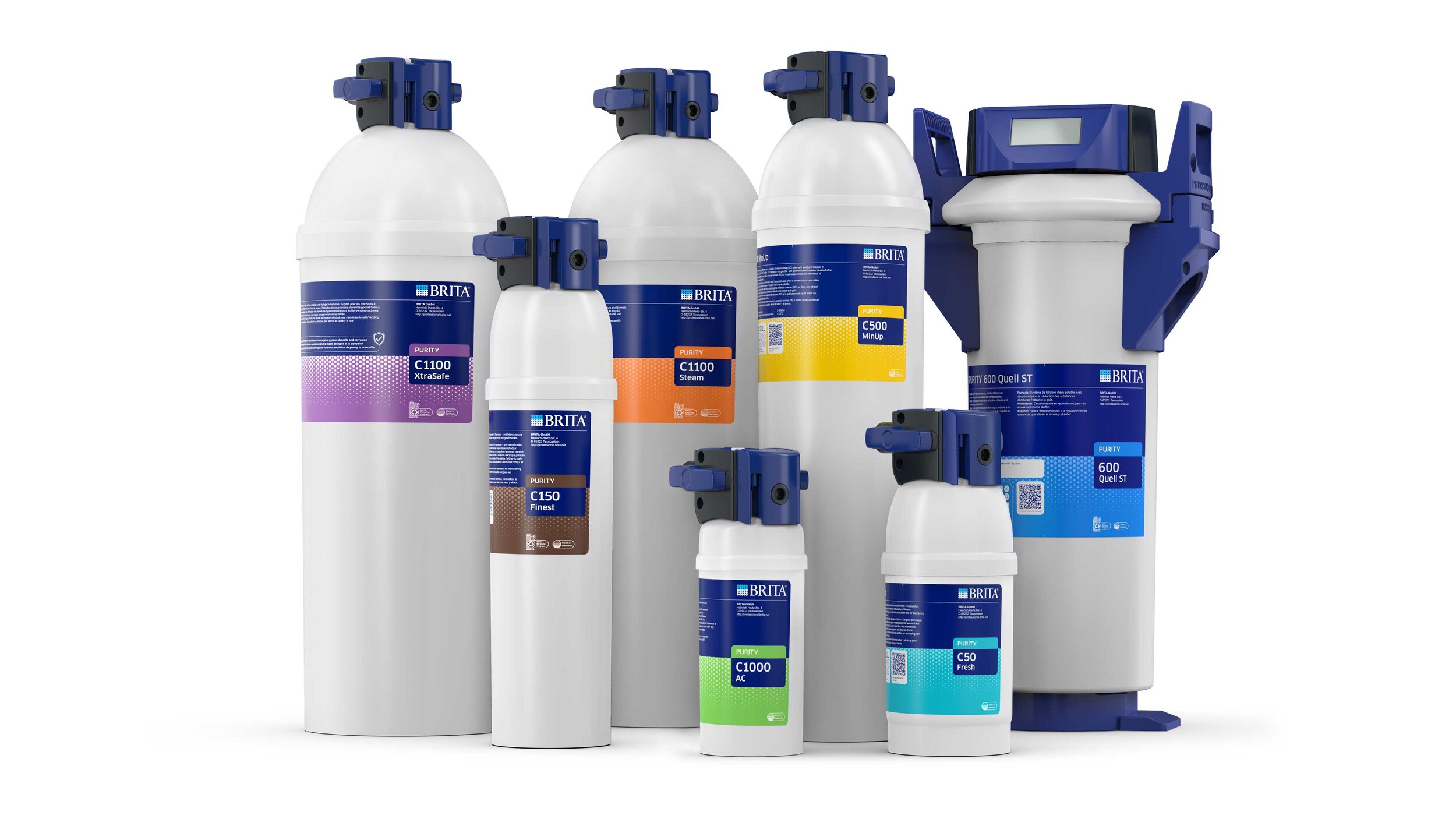
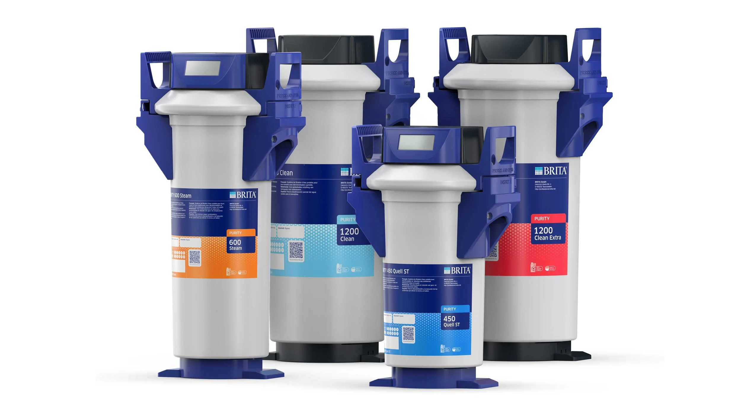
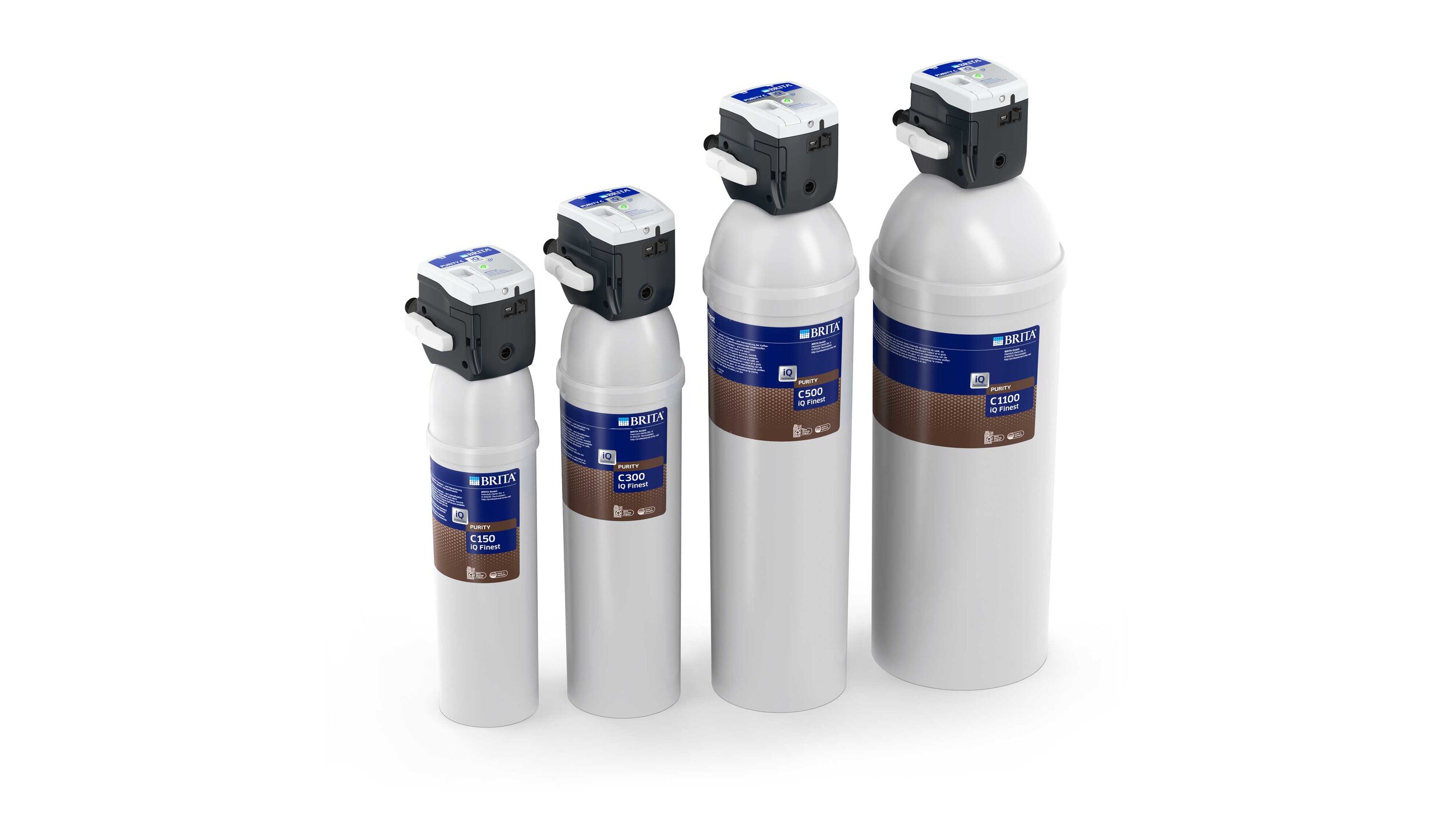
As part of an extensive label relaunch for the "PURITY" and "PURITY C" filter systems, yellow design has developed a visually high-quality and appealing label design that goes hand-in-hand with a functionally informative layout.
"The successful combination of functional, user-friendly infographic and creative, concise label design."

The new visual concept not only significantly enhances the products, but also improves the visibility and legibility of the important information, thereby optimizing the entire user experience.
In addition, the horizontal separation of brand color and filter color code sharpens the facing of the product family, which reinforces the brand's affiliation.
In addition to the label design of the filter cartridges, the labels of the filter heads have also been integrated into the new design concept, including the development of special icons for the topics "BRITA Recycling System", "Made in Germany" and other features.
"A consistent design concept that visually connects all components of the overall packaging with one another"

The new BritA Professional Filter
color coding system
The new label concept has a clear information hierarchy, a distinctive layout and a striking color guidance system.
Next to this a reduced key visual, which refers to the central theme of "filtration", delivers a significant background structure, which visually holds the entire range together as a connecting element.
"A Strong B2B-color concept with an untypical B2C-Look."

BRITA International:
CD adaptation for the American and Chinese markets
The international adaptation for the Chinese market as well as for the North American brand "VIVREAU" shows the flexibility of the new label design.
With the Chinese label, the proportion of brand color to filter color was changed and the layout was adapted accordingly in order to integrate the larger amounts of text without fundamentally changing the appearance. By this means the family affiliation is retained even with these strongly modified labels.
"A CONSISTENT CD ADAPTION FOR THE INTERNATIONAL MARKET."
CGI: product renderings
yellow design has comprehensively accompanied the complete relaunch of the entire professional filter range with high-quality product presentations: For the images of the new products and filters with updated labels for the BRITA and VIVREAU brands, a total of over 200 photo-realistic product renderings have been created in a wide variety of perspectives and arrangements.
The resulting CGI representations of the “new” products are now being used extensively on the BRITA website and on the brand's other various communication channels.
Thanks to the use of digital display options, it was possible to save time during the launch process, as the images were created before the products were SOP.


Related projects


